From Clutter to Clarity:
Crafting an Investor-Ready Mobile App for a Startup
Maka Health is a startup company seeking to become a leader in the functional wellness healthcare community online.
What can Maka Health do?
Users fill out a functional wellness questionnaire. Based on the answers to the questionnaire, the app will recommend educational videos, products, and services related to health.
Users will be given a Maka Score - the more engaged they are in the app, the better their score will be.
In the future, Maka Health also plans to release their own cryptocurrency called MakaCoin. Users can spend MakaCoin to buy other products in the marketplace area of the app. The more engaged users are, the more chances they have to earn MakaCoin.
Tools Used:
Stakeholders I reported to:
Chief Executive Officer/founder of Maka Health
Chief Strategy Officer and Co-founder
Target users:
Potential investors
My Role:
I worked alongside 3 other UX designers. I created:
UX Audit
Home Screen for mobile app/navigation bar
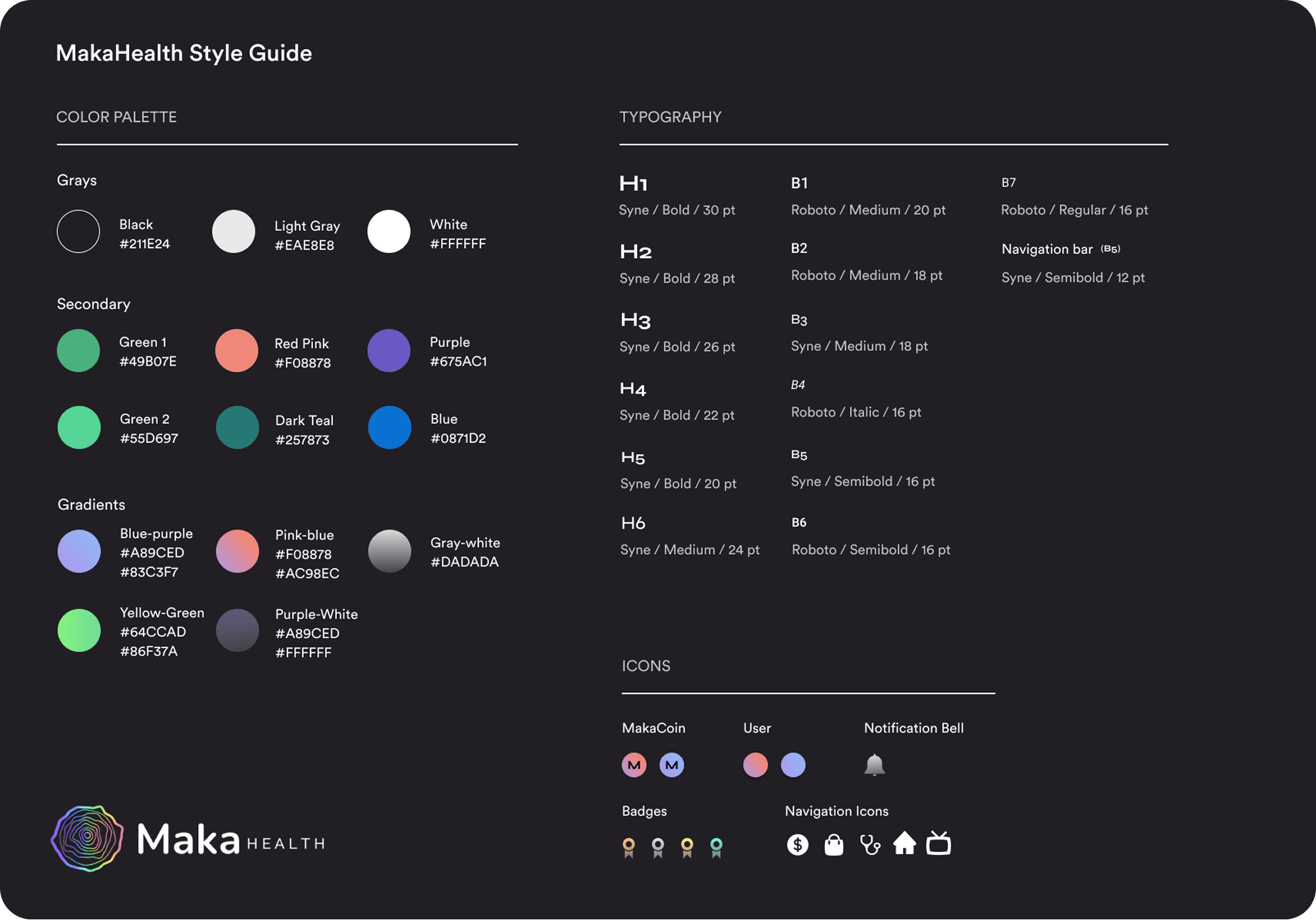
Style Guide
Time Frame and Constraints
1 month contract position
Must keep the dark UI style and fonts consistent with the aspects of the product that already exist.
Project Goals
Designed a clickable high-fidelity mobile prototype showcasing core features for investor presentations.
Conducted a UX audit of the existing desktop beta app and website to identify key areas for improvements.
What Stage of Development was the Company at?
Maka Health had a beta desktop site available internally (not public). No mobile app existed yet. Their public facing website was a landing page allowing users to join a waitlist that would notify them when the application was live: https://www.makahealth.com/
Note: Maka Health has since rebranded and is now WellMe.ai. They operate in the longevity health and wellness tech space.
Main Challenges
As an early-stage startup, the company was still defining its product direction, making it challenging to prioritize features for investor demos. Product decisions were often made collaboratively in real time, requiring frequent communication.
Since the mobile app was being designed from scratch, we were responsible for establishing design standards and creating the style guide.
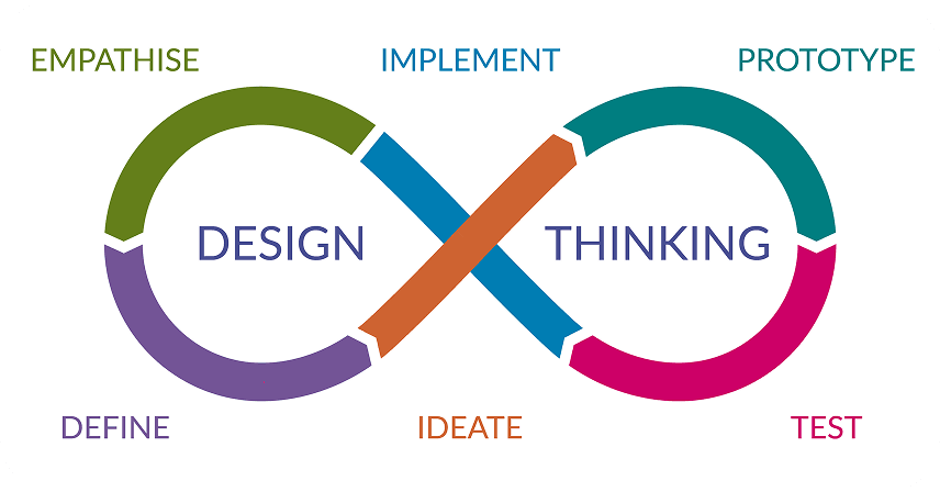
Typically my design process would look something like this.
However, because the goal was to make a prototype for investors, I shifted to a deliverable-based process.
I would create sketches, wireframes, or hi-fidelity screens, and get feedback from company stakeholders and the design team to make iterations.
No user testing was conducted due to time constraints, and because the product had no active users yet.
UX Audit and First Sketches
My first goal was to understand the features of Maka Health.
When exploring the website/public landing page, and the unreleased beta desktop app, I found some issues with accessibility and consistency, as well as a few other usability heuristics.
For more information on the 10 main usability heuristics, visit this article from the Nielson Norman group.
I created a UX audit as a 40 minute video recording.
Watch UX Audit
Sketches
The CEO and founder provided sketches that she created, for main screens that should be included in the final hi-fi prototype. The design team worked together to break up the work. I created the home screen and navigation bar.
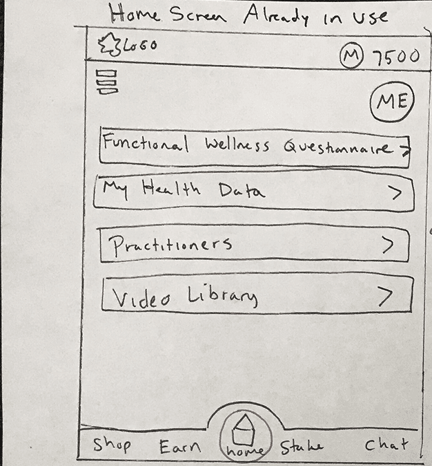
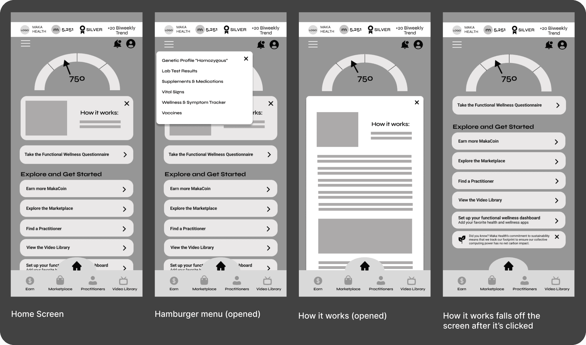
My home screen sketch
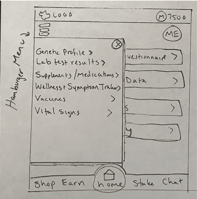
Hamburger menu opened
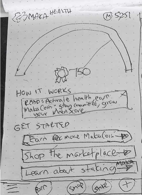
Home screen sketch from the Maka Health CEO
Why did I create my own sketch of the home screen?
I aimed to balance the CEO’s initial sketch with established UX best practices, while ensuring key desktop features (originally overlooked in mobile app discussions) were accessible via the hamburger menu (center image).
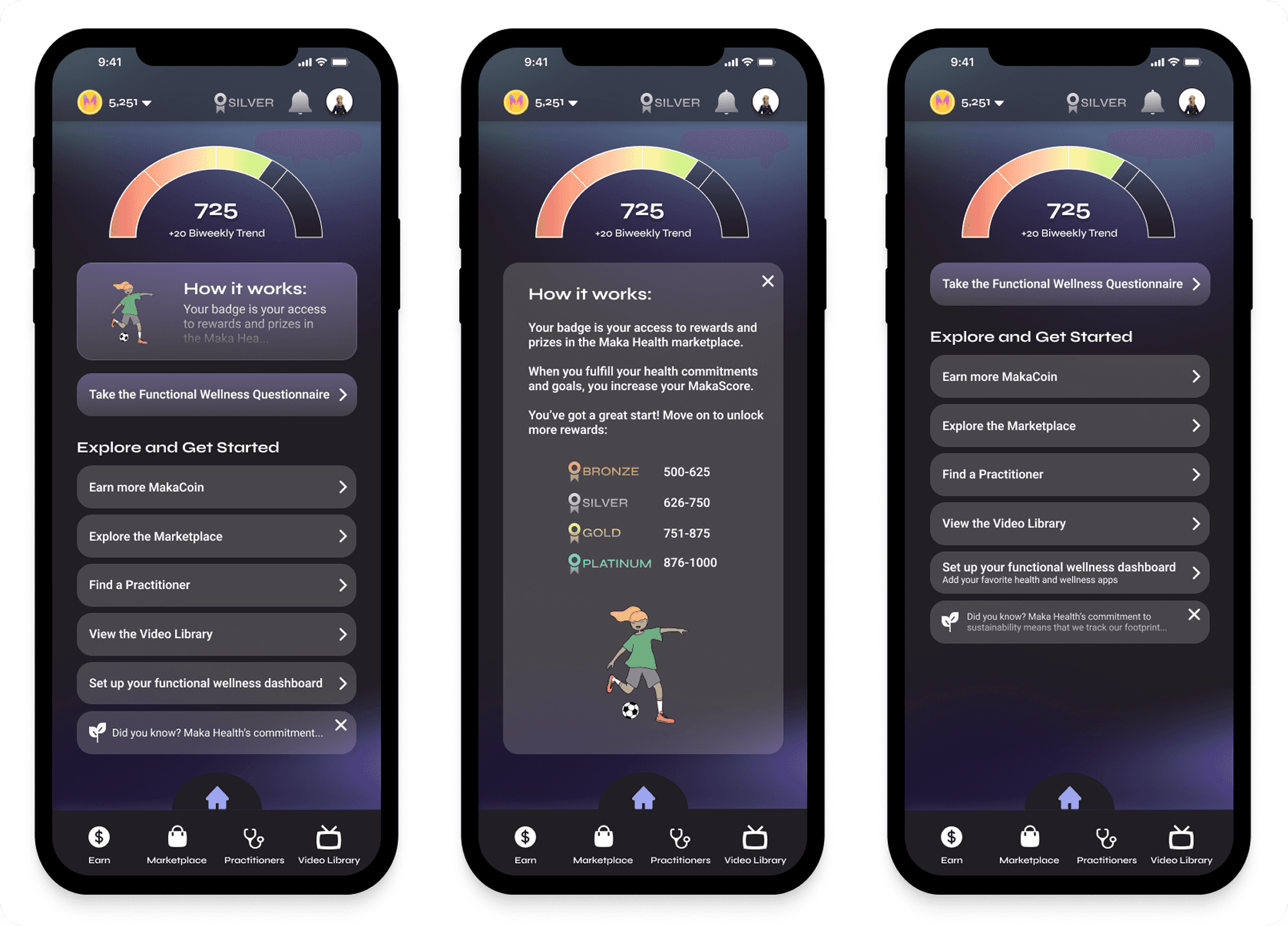
Wireframes: Gamifying the Experience with Scores and Badges
Before the wireframes were created, I needed to understand the purpose of the Maka Score and the dial image that the CEO sketched for the home screen. I had not included this in my own sketch, and I received new information that this feature would be integral to the app.
What is the Maka Score?
The Maka Score ranges from 1–1000 and is divided into four badge levels: bronze, silver, gold, and platinum.
Higher scores unlock greater access to marketplace offerings. For example, exclusive items like free health sessions may be reserved for platinum users.
The score increases with consistent app engagement and can remain visible only on the home screen.

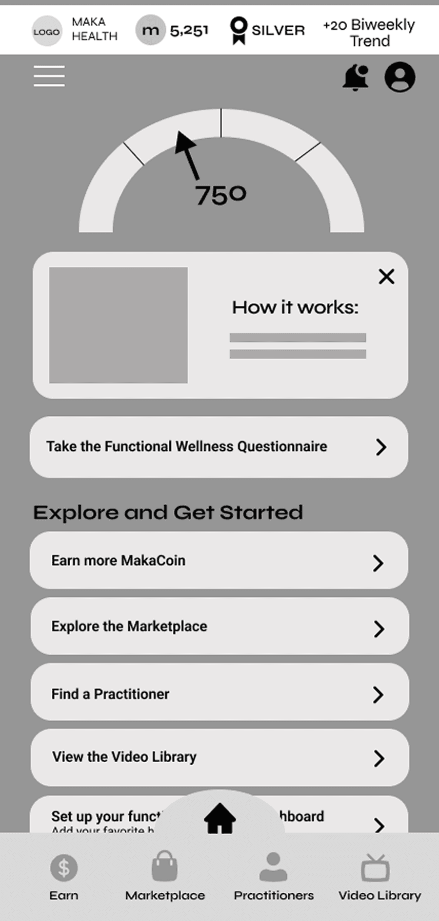
Some items that changed from sketching to wireframing:
Navigation bar - to be more consistent with the desktop app’s navigation, the main features of the product (booking practitioners, marketplace to buy items, and educational videos) were included in the final bottom navigation bar.
Additional functionality, such as notifications and badges, were later added to the top of the screen based on updated input from the CEO.
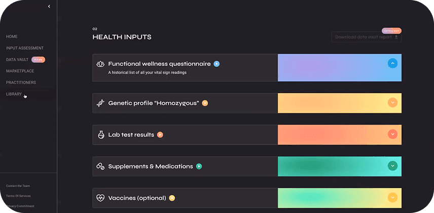
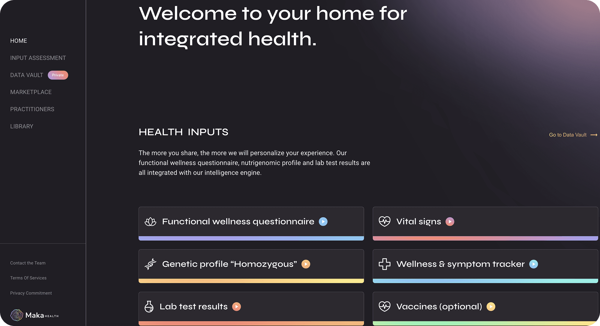
Dashboard home screen in the desktop app with left-side navigation:
We needed all appropriate navigation options to be available for both desktop and mobile. A hamburger menu was added so we could fit additional items in the mobile app.
Stakeholders requested a “How It Works” card on the home screen for new users. After viewing, the card would disappear to reduce clutter, with the content accessible later in a separate section of the app.
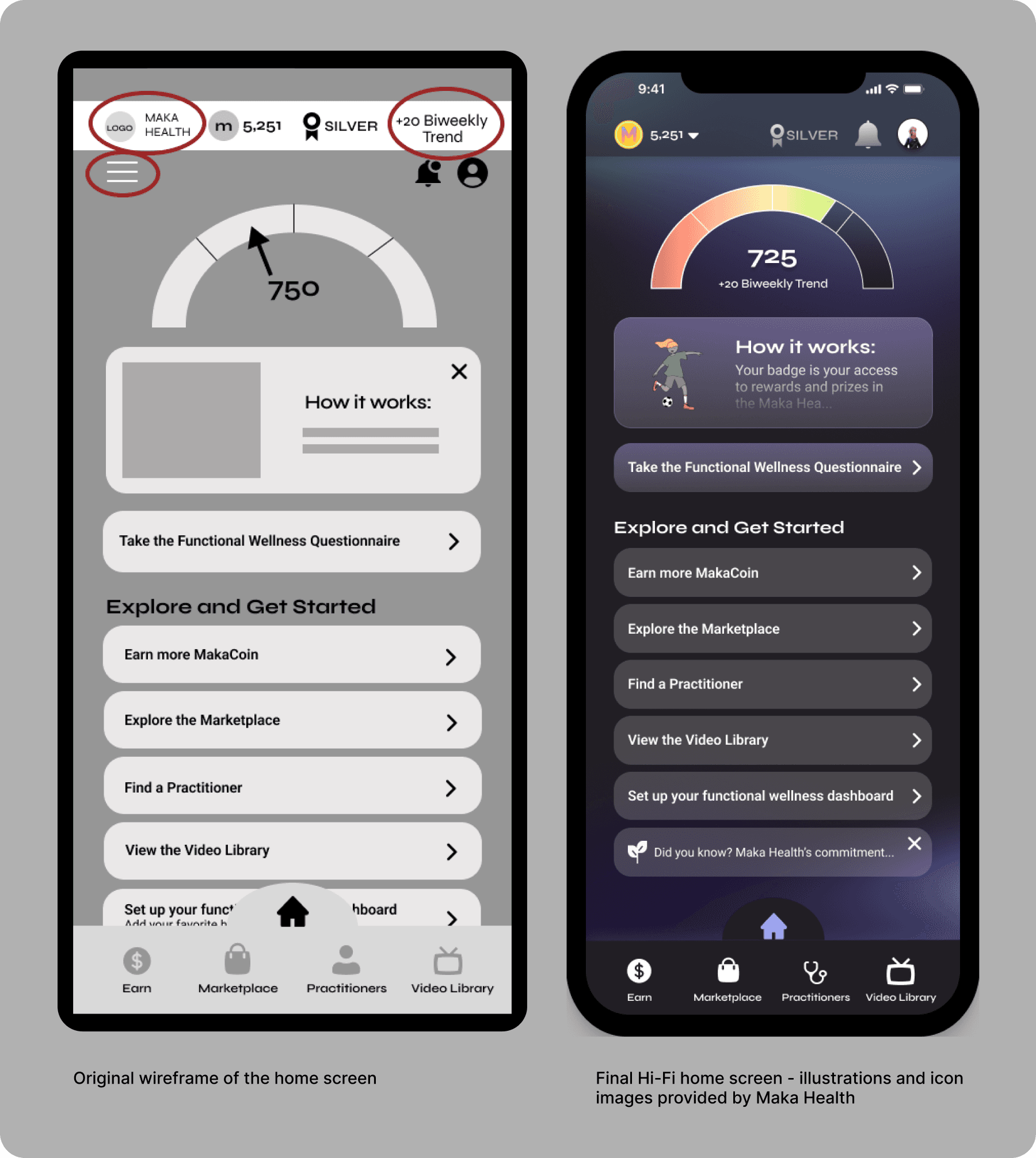
Hi-Fi - How Did I De-Clutter the Home Screen?
The CEO and design team all agreed that the top area of the screen seemed cluttered in the wireframes. But we still needed to find a place to put the additional elements.
Removed the hamburger menu from the top bar: information that would have gone under this area will be housed under the profile/avatar icon.
Since the bi-weekly trend is referring to the Maka Score, I put it directly under the score number in the dial.
The Maka Health logo was removed from the home screen since it does not serve a purpose in the app, other than branding.
Is the Customer Always Right?
When working with clients, the goal is to ensure maximum usability and follow UX best practices, while also creating the client’s ideal vision.
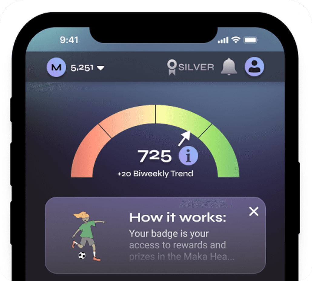
While aiming to balance usability with stakeholder vision, I was asked to include an (i) icon next to the Maka Score dial for more info.
I explained that this is usually a desktop UI pattern and doesn’t translate well to mobile due to accessibility and tap target size.
I shared a mockup to demonstrate the issue, showing how large the (i) would need to be, in order for fingers to tap it.
Stakeholders agreed to omit the icon. Instead, we placed the score details under the profile icon to maintain clarity without cluttering the UI.
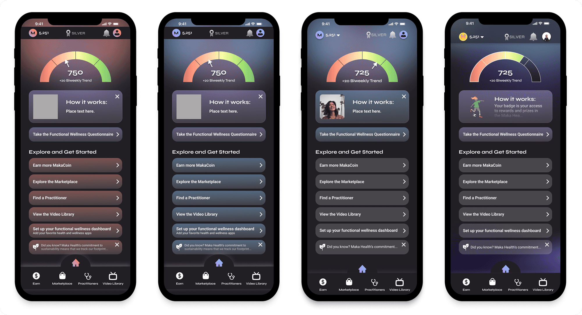
After multiple iterations and communication with stakeholders, the final home screen was born. Here are some options I explored:
Final Home Screen Flow and Style Guide
Reflections and Conclusion
Next Steps for Make Health
Maka Health was pleased with the outcome and will use the Figma prototype for investor presentations.
The new style guide and UX audit now serve as a foundation for future design work on both the mobile and desktop apps.
I advised the client to validate the prototype by performing user testing, to ensure that users do not encounter navigation issues. I could not perform user testing myself, because of time constraints.
What I Learned
This was my first time designing a prototype with the goal of gaining investor attention, and this shaped my approach.
As Maka Health’s first mobile prototype, it required guiding stakeholders through detailed design decisions they hadn’t previously considered.
I asked targeted questions, encouraged design thinking, and helped align on a shared vision, making iteration smoother.
This project strengthened my ability to balance UX best practices with client goals, and to advocate for design choices using data and visual examples.
It also gave me valuable experience working with an early-stage startup, where I not only contributed to the product but also helped educate stakeholders on UX fundamentals, which will help them grow their business in the future.